

Beyond the Barbed Wire
Logo and Visual Brand
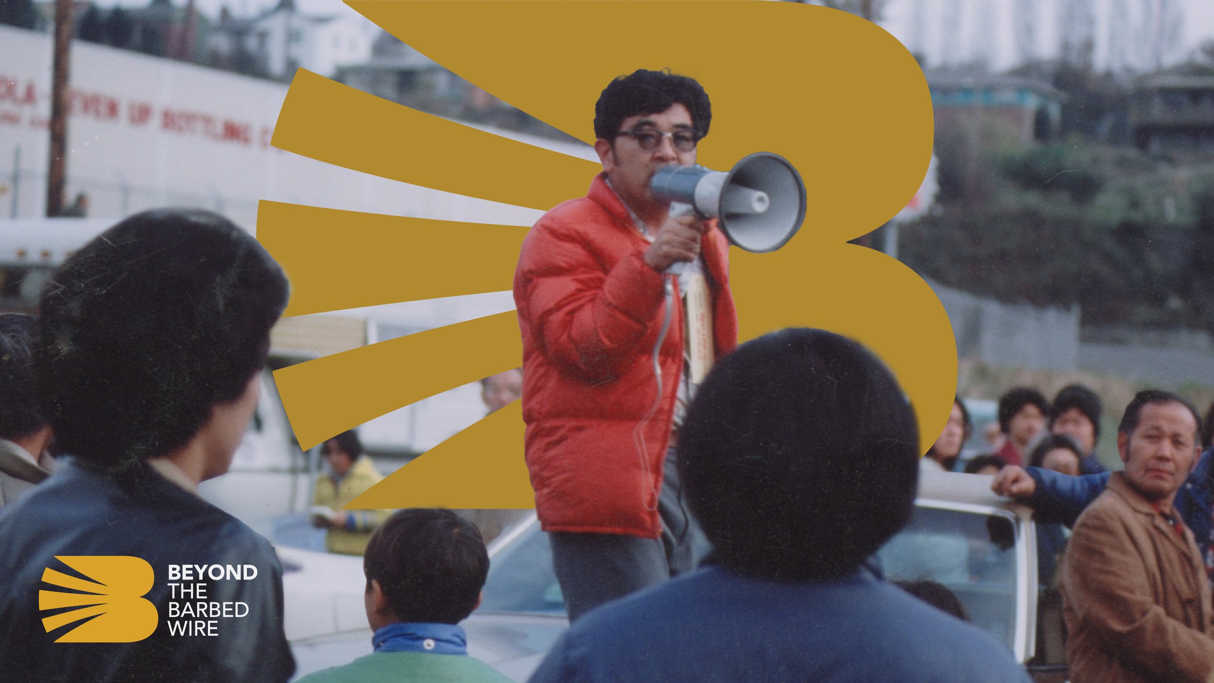
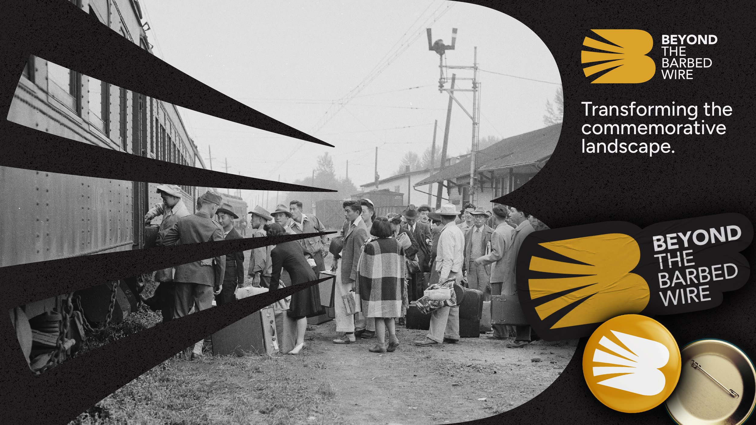
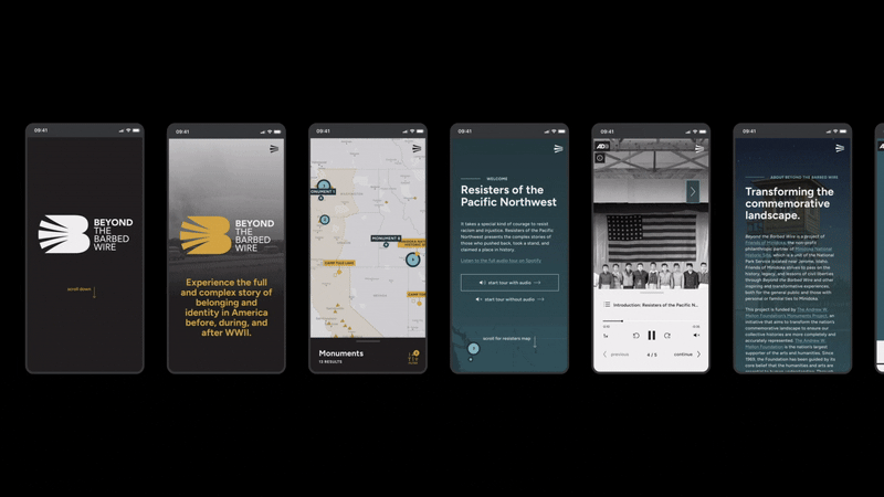
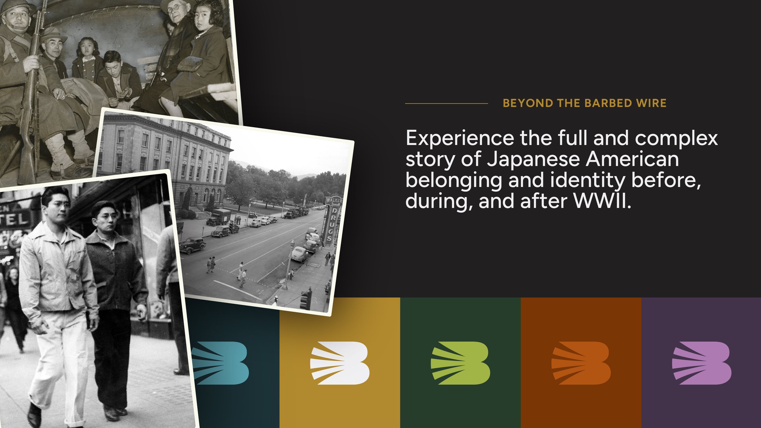
Working for Stoltz Marketing Group, I designed the logo and visual brand for Beyond the Barbed Wire, an immersive virtual platform that shares powerful stories of Japanese Americans who resisted injustice around WWII.
The mark is rich with symbolism. Not only does the logo look like a “B” for Beyond the Barbed Wire, It also resembles a resilient bird taking flight—representing freedom, hope, and endurance, much like the birds carved from scrap wood by Japanese American incarcerees as an act of gaman (enduring the unbearable with dignity).
The sharp, negative space in the tail feathers reflects the oppression Japanese Americans faced, with receding shapes evoking the desolation of imprisonment—barbed wire, stark barracks, and a stripped-away culture.


-
Stoltz Marketing Group
-
Mitch Kuhn - Creative Director
Deanna Scherrer - Sr Art Director
Clara Thamke - Art Director
Ty Yamamoto - Illustrator
-
Brian Detweiler
Mike Kerby / c308
-
Designer - Visual Brand Design